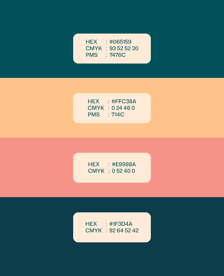
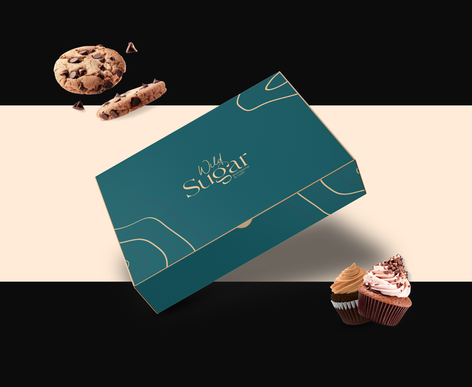
The Execution
Our process began with an immersive exercise that helped the team deeply understand the brand, gaining insights from both the founder’s vision and the consumer’s perspective. These learnings then guided our writers and designers in shaping a focused and impactful brand strategy.

.jpg)

.jpg)

.jpg)