HOC is a minimalist design studio that swears by “less is more”. Their architectural principles adopt a blend of modernist and contemporary styles. With a beauty + function belief, their work extends to ventures in South Australia.
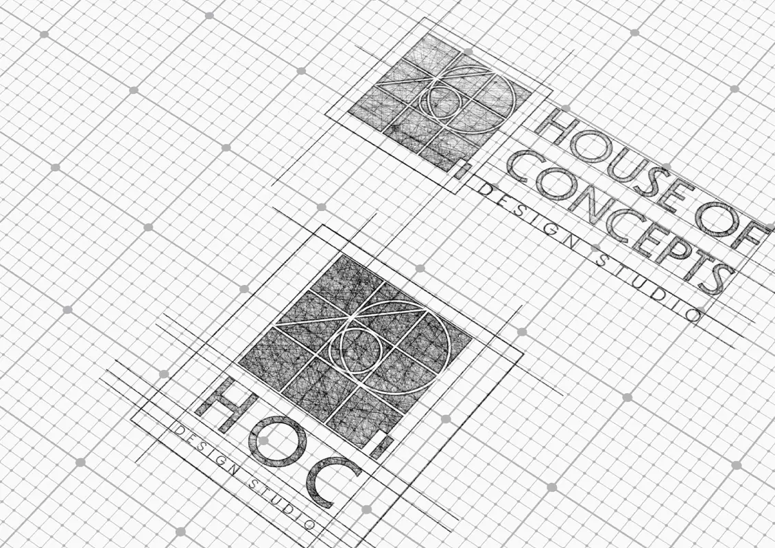
Logo Construction and Orientation
The logo embodies the minimalism House of Concepts stands for, using geometric shapes and patterns to represent architecture as a concept. The sketches explore its various orientations and applications.
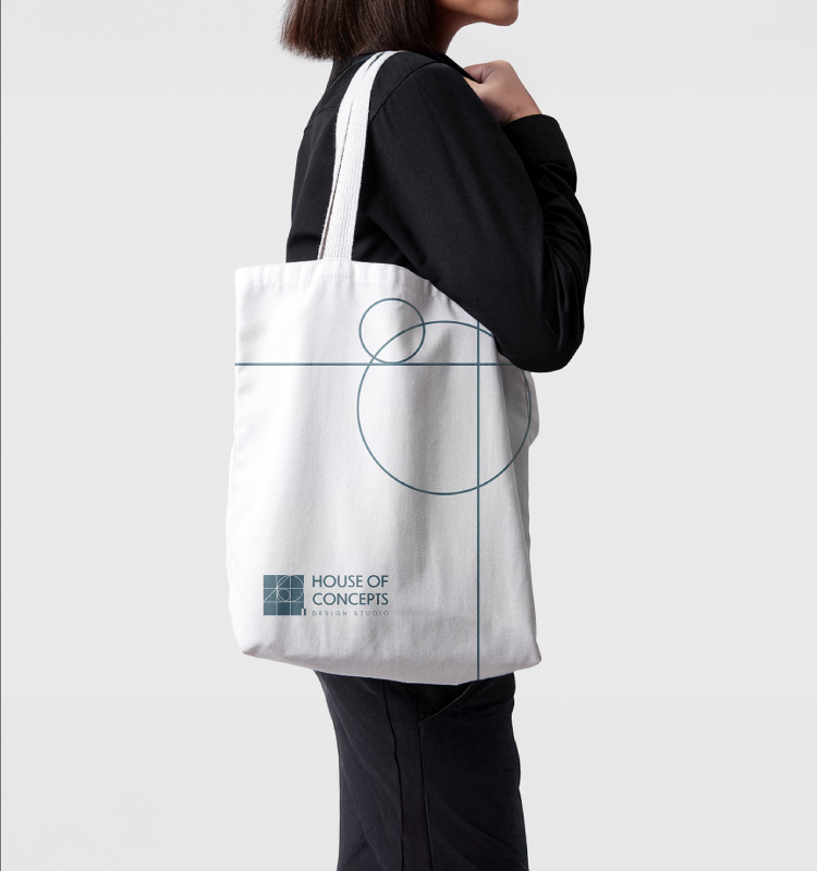
Brand Mockup
A glimpse of how the logo looks on brand merchandise. Minimal, sharp lines grace the tote bag perfectly, while the sleek water bottles carry the mark with refined logo and text placement.
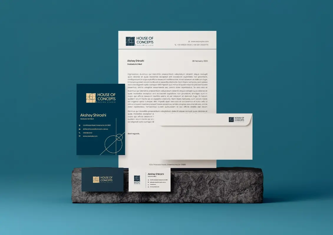
Brand Collaterals
As seen in the collaterals, a consistent colour palette and straightforward brand patterns ensure the brand’s essence is maintained throughout the design process.